

Packaging, Brand Identity, Research, Copywriting
Packaging, Brand Identity, Research, Copywriting
Your period isn’t one week; it’s a month of health and understanding. Frank provides a full-cycle approach to menstrual health, helping individuals access the right nutrients at the right time to improve their relationship with their hormones. Frank addresses each stage of the menstrual cycle head-on—filling necessary nutritional gaps and acting as an educational hub. The brand empowers anyone who menstruates to be knowledgeable about their cycle so they can reclaim the days they’ve lost to cramps, breakouts, indigestion, mood swings, and headaches. We’re not your Aunt Flow; we’re Frank. And we‘re tired of the euphemisms tied to your menstrual cycle.


The Products: The primary packaging is made of aluminum and consists of four core products: Full Cycle Supplements, Hemp Balm, Seed Cycling Bites, and Birth Control +.
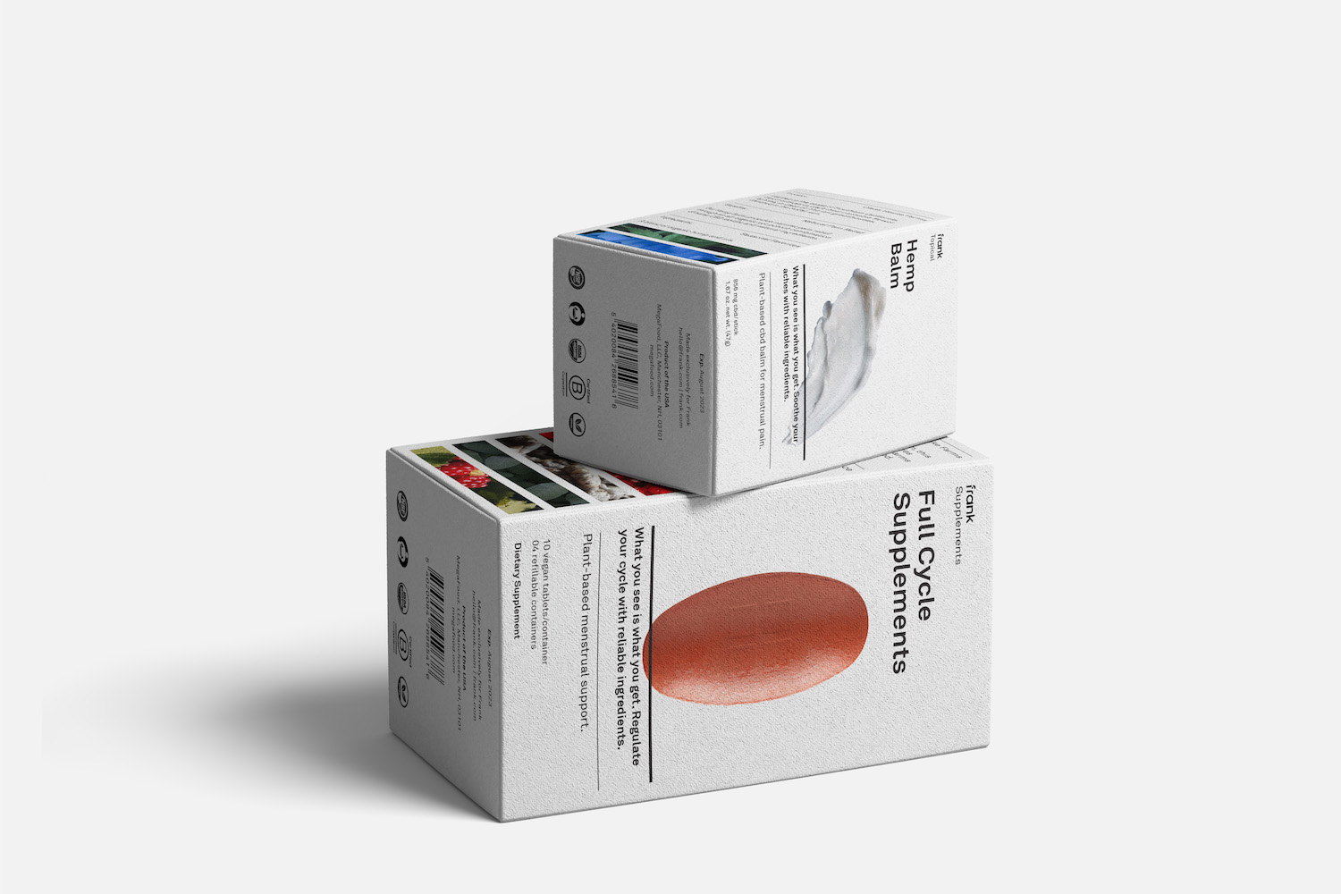

The Packaging: The secondary packaging is inspired by the tech sector—providing a clean aesthetic that places the product at the forefront. Each folding carton specifies the product’s benefits as well as the ingredients and the farm where the ingredients were sourced.


The System: Frank is a closed-loop system. Refills are sent to the customer’s home to replenish their existing aluminum containers.


The Language: The brand language highlights and debunks the euphemisms associated with periods like Aunt Flow, Niagara Falls, Red Tide, and Code Red.